Going into my third year of producing mini-movies, the one thing I have learned for certain is that I have so much more to learn. If I live true to my mantra of “Why tell a story if it’s safe?”, each project I work on should push my knowledge and involve techniques and challenges I haven’t faced before. This was certainly the case with SICK. SICK provided so many ways to use some cool techniques and learn some new ones.
The Hallway
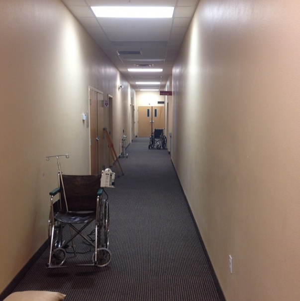
Rather than shooting in a medical facility (though we tried to find one), we decided to bring in medical equipment and convert the back hallway of our church into the set. This gave us much more flexibility and time both preparing for and on the day of the shoot.
The Lighting
The hallway is lit with fluorescent in the ceiling, so we started with those, taking out two of every 3 lights to give a bit more dynamic diversity in the hallway.
One of the biggest challenges of “SICK” was the hallway lighting. I knew I wanted the hallway to be dingy and gross, giving a sense that you did not want to be there.
I also wanted the room at the end to be a bright and clean feeling room.
I could have achieved this in post production, but it was much easier to do this with different lighting fixtures and gels on the set.
Another reason for doing it on the set was the final shot would show both the clean room and the dingy hallway. I wanted there to be an obvious contrast in the lighting.
I knew that if you white balance to a tungsten (normal household) lightbulb, that automatically gives most fluorescent bulbs a greenish tint, but in my tests, it wasn’t green enough.
To add to the green tint, we also used “plus-green” gels to the hallway, and “minus-green” gels to the last room. We then used a custom white balance from the final room, which made the hallway even greener.
The Smoke
One other thing we did to add a bit of nastiness to the hallway was to use a hazer. These are often used in films to add a bit of texture to the air and make it feel more aged. We used a light covering, not billows of smoke. More of a constant layer of texture in the air which can be seen nicely in the final shot of contrast.
The Blocking
One of my biggest fears about this project was the blocking of 25 extras (telling them where to stand and when to move).
Most of my projects involve very small casts, and only 1-2 extras if any.
Sick however was mostly a hallway of 25 people, most of them moving to and from somewhere.
I happened upon an amazing ipad app called Shot Designer that made this process so much better. It allowed me to create my hallway, place my props, actors and camera, and even animate the character and camera movements so I could know what it all looked like before I got there.
This video required me to push my boundaries and learn new skills and techniques – something I feel to be crucial when seeking to improve my craft.
How have you been challenging yourself lately?


