When looking to enhance your services with visuals, purchasing media from sites like WorshipHouseMedia.com and SermonSpice.com is almost always the best and fastest route. Occasionally though, it’s fun and/or necessary to personalize the church experience with your own homemade design.
The next time you’re looking to promote an upcoming event or sermon series and can’t find what you need on WorshipHouse or SermonSpice, don’t rely on stock photography sites! Instead, try incorporating photos of fellow church members into your media. Why is this a fantabulous idea? In large part because recognizable faces can resonate with your congregation, making it more likely that they’ll remember and relate to what they’re viewing.
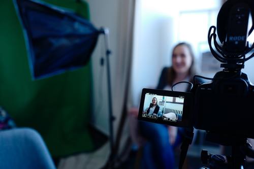
In this four part series, we’ll discuss some tips and general guidelines to consider when creating your homegrown media. You won’t need a fancy camera, photography classes or any special expertise, just follow along with this series and rev up your imagination. The first step in the process is to plan your composition(s) in preparation for a D.I.Y. photo shoot.
Know Your Why
Make sure that you’re not using photos of church members just for the sake of doing so. The imagery should always support the theme of the service, sermon or event. The last thing you want to do is distract from the intended message by adding irrelevant or excessive imagery. Staying focused on the theme is critical, and this is where brainstorming and planning make all of the difference.
It’s OK to be Sketchy
Start your design by sketching some concepts, always keeping in mind the question: “What am I trying to communicate with this piece of media?” You don’t have to be Andy Warhol for this step, just try to get some ideas on paper that can help you frame your design. Here are some general rules of thumb to keep in mind:
 If your imagery wasn’t accompanied by text, would it still tell a compelling story about the theme of the service, sermon or event? If not, keep brainstorming!
 Your congregation’s first reaction to the design shouldn’t be “Hey! That’s Larry!” Instead, plan the focal point around the part of your design that best represents the theme. The fact that the model is a fellow church member should be a subtle tip of the hat, not the main focus.

Your brainstorming sketches should (almost) always provide ample text space. Accounting for where your text will be placed later on will save you headaches in the long run.
What’s Next?
In the second post of this series, we’ll look at tips on how to compose and shoot photographs like a pro, even if you’re not one. We’ll also discuss the importance of selecting the right church members for your designs. So, what are your thoughts on personalizing media for your church? Have we missed an important Do or Don’t so far? Let us know in the comments section below!


oooooh man, this post was suuuper cool!
ok, just kidding… this is the author.